
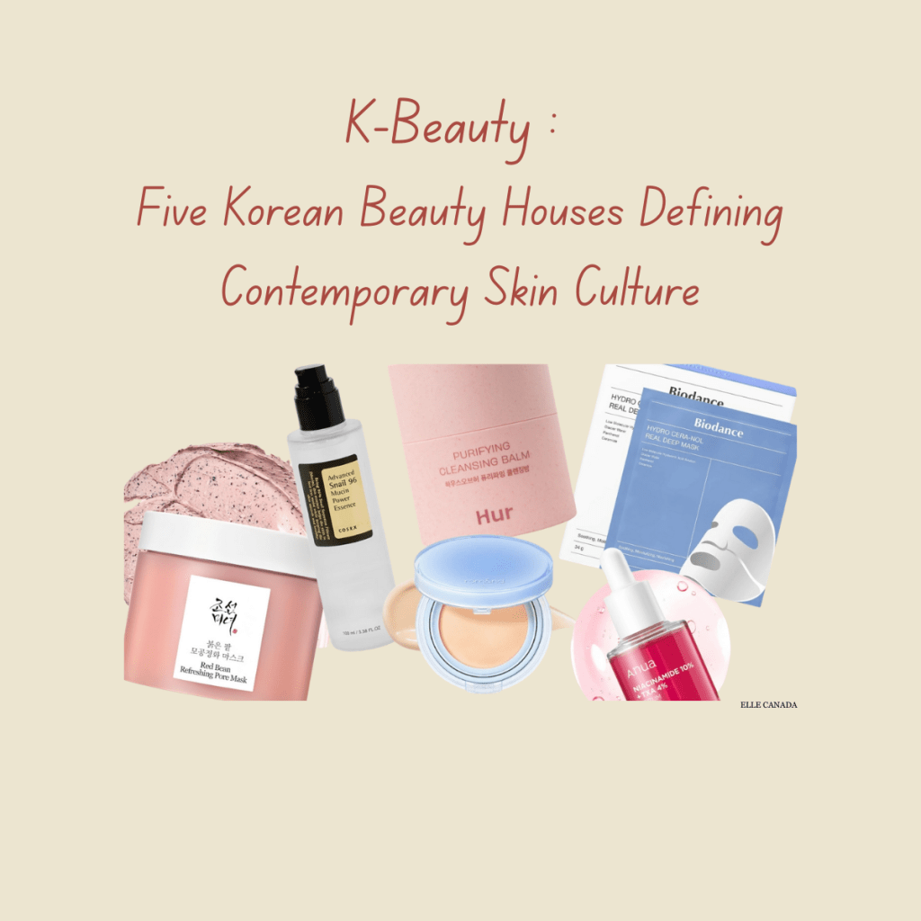
How Communication, Design, and Ingredients Work Together
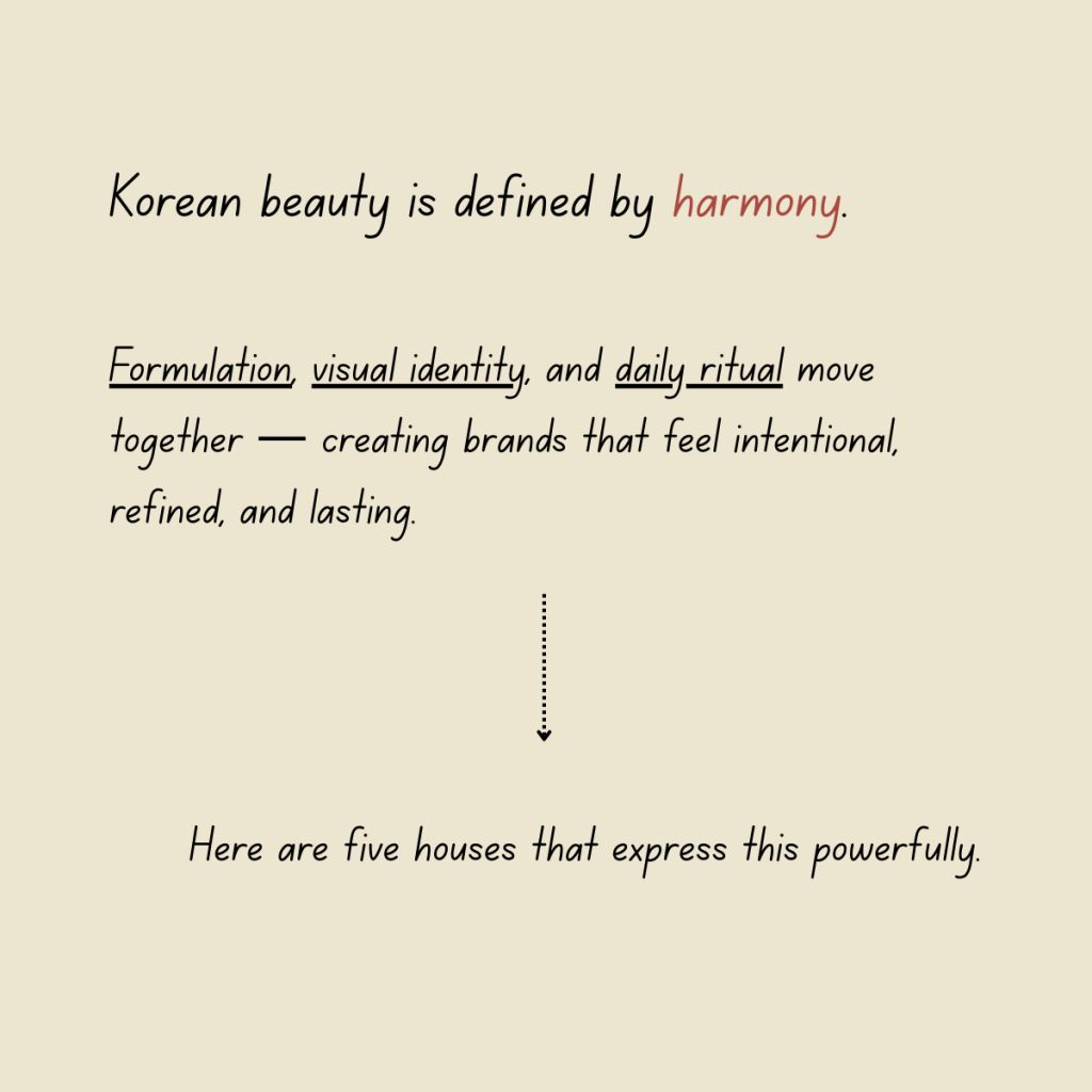
Korean beauty brands are often admired for innovation, but their real strength lies in how they connect formulation, visual identity, and everyday communication into cohesive brand systems.
Each of the brands below represents a different approach to modern beauty — from clinical clarity to heritage storytelling — offering valuable insights for anyone interested in branding, design, or creative strategy.
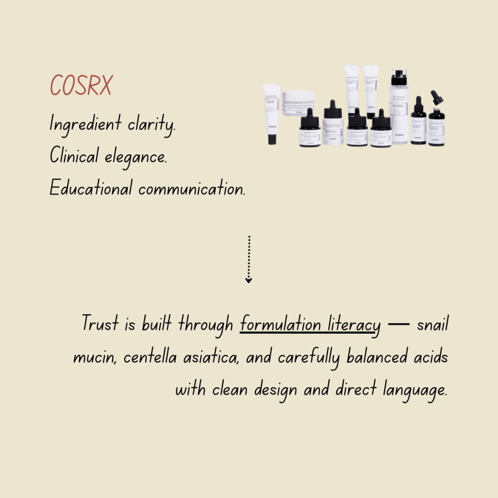
1. COSRX
Ingredient-First Communication
COSRX is built around ingredient transparency.
Product names directly reference actives. Labels clearly explain usage. Educational content focuses on skin concerns and formulation logic.
Key ingredients such as snail mucin, centella asiatica, and AHA/BHA acids are consistently highlighted across packaging and digital communication.
Design supports this approach: neutral colors, clinical layouts, and straightforward typography.
Brand takeaway: COSRX shows how clarity builds credibility — when ingredients lead, trust follows.
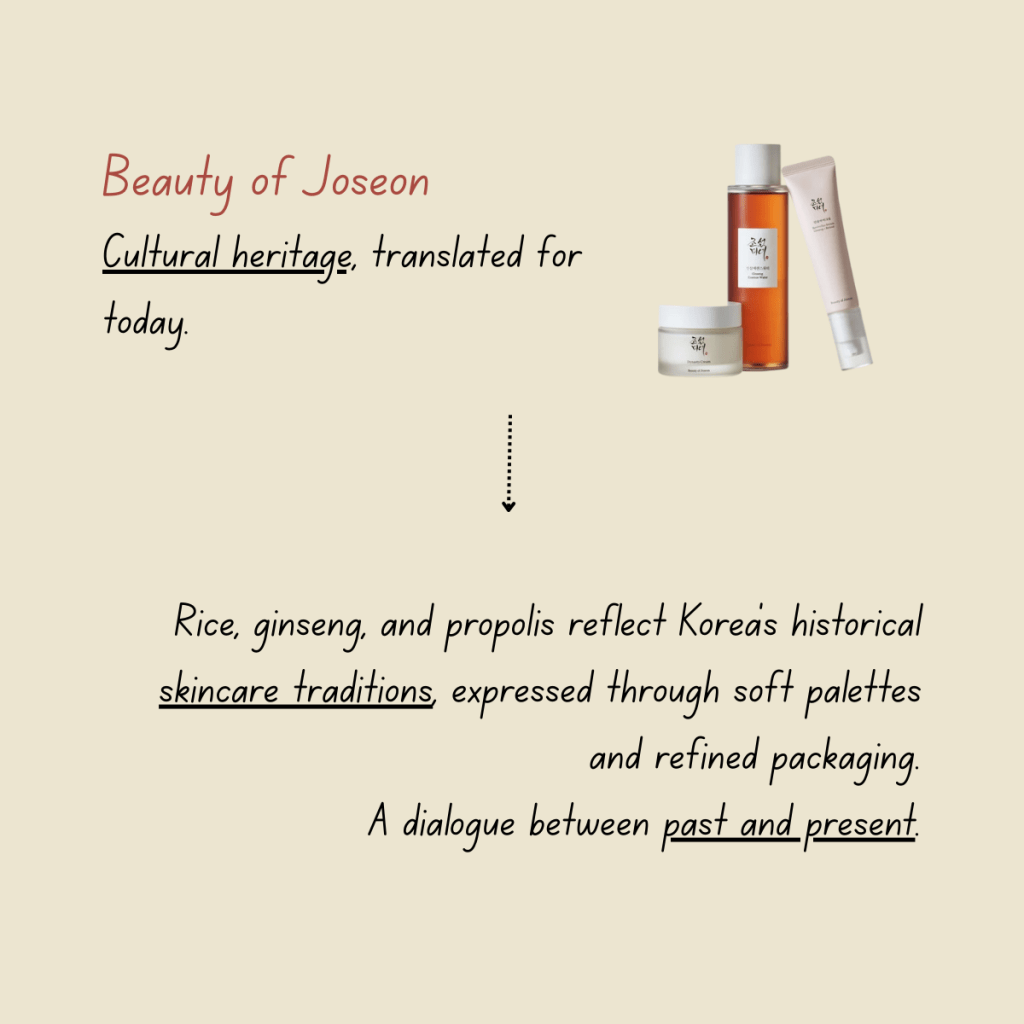
2. Beauty of Joseon
Cultural Heritage as Brand Language
Beauty of Joseon draws inspiration from traditional Korean skincare practices and aesthetics.
Ingredients such as rice extract, ginseng, and propolis are positioned as both functional and cultural — associated with nourishment, longevity, and balance.
The visual identity reflects this positioning through muted tones, subtle typography, and references to historical Korean design.
Brand takeaway: Beauty of Joseon demonstrates how heritage can become a contemporary creative asset.
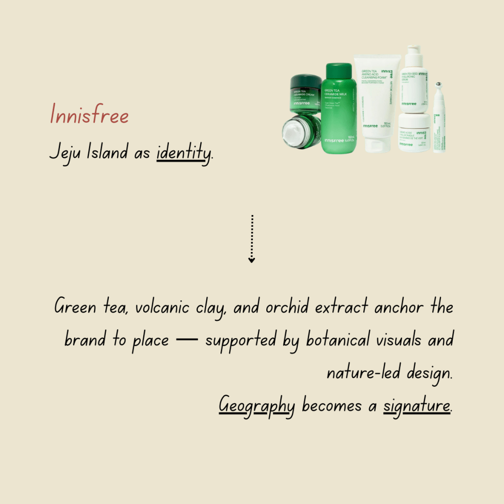
3. Innisfree
Place-Driven Brand Identity
Innisfree is built around Jeju Island and its natural resources.
Green tea, volcanic clay, and orchid extract are consistently tied back to origin and sustainability. This geographic grounding shapes both product development and brand storytelling.
Design reinforces this connection through earthy palettes, botanical imagery, and eco-conscious packaging cues.
Brand takeaway: Innisfree shows how geography can become a long-term identity pillar when integrated across ingredients, visuals, and messaging.
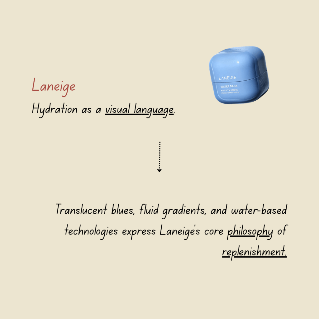
4. Laneige
Hydration as a Visual System
Laneige centers its brand around hydration.
This focus appears everywhere: translucent packaging, blue gradients, fluid campaign imagery, and product formulations based on water science and hyaluronic acid.
Hydration is treated not only as a benefit but as an emotional and visual theme.
Brand takeaway: Laneige illustrates how owning a single core concept — and expressing it consistently — strengthens brand recognition.
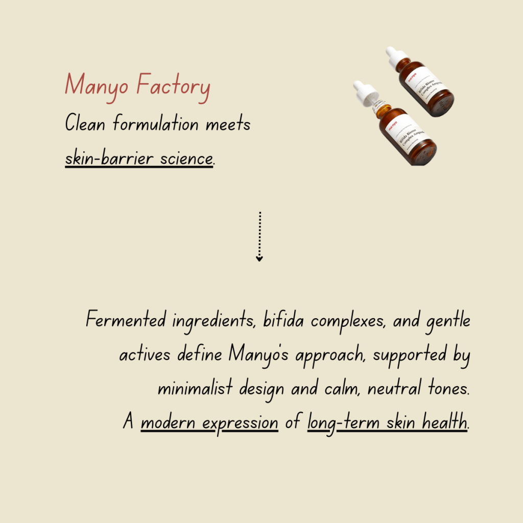
5. Manyo Factory
Clean Beauty Meets Skin Barrier Science
Manyo focuses on gentle formulations, fermented ingredients, and microbiome-friendly actives.
Products often feature bifida complexes and barrier-support ingredients, addressing long-term skin health rather than quick fixes.
Its communication style is educational yet approachable, supported by minimalist design and soft neutral palettes.
Brand takeaway: Manyo reflects the shift toward resilience-focused skincare, combining scientific language with accessible branding.
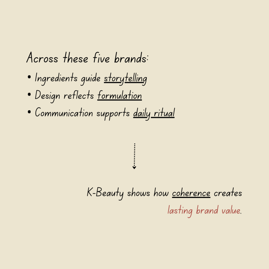
A Shared Approach
While each brand occupies a different space, they share several common practices:
- Ingredients are central to storytelling
- Visual identity reinforces product positioning
- Communication prioritizes education and routine
- Brand meaning is built through consistency over time
Together, these brands show how K-beauty connects formulation, design, and daily use into unified brand ecosystems.
For creatives, strategists, and founders, they offer an impactful lesson:
Brand distinction is cultivated where communication, aesthetics, and formulation converge.

Leave a comment